You are here: Articles > Overview of Button Usage in JSDialog Pack
Version 1.2
19/03/2008
This article discusses how to setup your dialog to use each of the
different types of buttons and also gives tips on when to use one button type
over another.
There are three types of buttons that a dialog can have.
1. Common
2. Custom
3. Command Link
The article also shows how to respond to button clicks when the dialog is
visible (by default any button click will automatically close the dialog) and
also touches on where to get further information on localising dialog buttons.
Demo 1 is a comprehensive sample application that ships with TJSDialog. I
encourage you to compile and run this sample application. If you want to do
something with TJSDialog then it will most likely be showcased in this
application. You can easily view the dialog in the Component Editor to
understand how the dialog properties are modified.
If you feel some aspect of TJSDialog could be helped with further
documentation then please send your request to mail@lmdsupport.com.
Note: This document is also applicable to TJSEditDialog and
TJSDialogCheck.
Contents
Overview of button usage
in TJSDialog
Where to modify Common
button properties
Adding a custom button to
a dialog
Using Command Link
specific options
How to handle a custom
button click
Appendix
A – Button Class Types
Custom buttons (not
Command Link buttons)
Custom buttons (Command
Link buttons)
Customising the button
class to use
Common buttons are the predefined buttons for the dialog. Most of the time a common button will give the user the required information to use the dialog effectively. Common buttons always return a ModalResult value. You cannot change the returned ModalResult for a common button.
The ModalResult for the dialog is returned either in the dialog’s ModalResult property or as the return value of the Execute method.
Table 1 lists the available Common buttons as well as the default English[1] caption and modal result constant value.
It is important to note that the TaskDialog native API method does not support all of the Common buttons but just a subset as indicated in Table 1.
|
Button Name |
Default Caption |
ModalResult |
Native API support |
|
cbYes |
Yes |
mrYes |
Supported |
|
cbNo |
No |
mrNo |
Supported |
|
cbOK |
OK |
mrOK |
Supported |
|
cbCancel |
Cancel |
mrCancel |
Supported |
|
cbAbort |
Abort |
mrAbort |
Supported |
|
cbRetry |
Retry |
mrRetry |
Supported |
|
cbIgnore |
Ignore |
mrIgnore |
Not Supported |
|
cbAll |
All |
mrAll |
Not Supported |
|
cbNoToAll |
No to All |
mrNoToAll |
Not Supported |
|
cbYesToAll |
Yes to All |
mrYesToAll |
Not Supported |
|
cbHelp |
Help |
mrNone |
Not Supported |
|
cbClose |
Close |
mrNone |
Supported |
Table 1
By default the visible Common buttons for a dialog is OK and Cancel.
Common buttons can be set to act as the Default and Cancel buttons for a dialog.
The default button action is performed when the user presses the Enter key when the dialog is active and no other control that accepts key presses is active.
The cancel button action is performed when the user presses the Escape key when the dialog is active.
You can use either the object inspector (Figure 1) or the included component editor (Figure 2) to modify the Common button related properties.
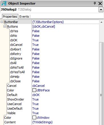
Figure 1
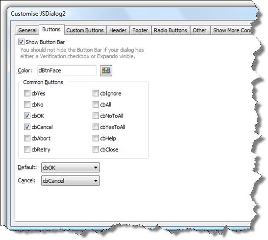
Figure 2
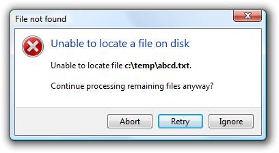
var JSDialog2: TJSDialog;begin JSDialog2 := TJSDialog.Create(Self);try
JSDialog2.Name := 'JSDialog2';
JSDialog2.Content.Add('Unable to locate file <b>c:\temp\abcd.txt</b>.');
JSDialog2.Content.Add('');
JSDialog2.Content.Add('Continue processing remaining files anyway?');
JSDialog2.Instruction.Text := 'Unable to locate a file on disk';
JSDialog2.ButtonBar.Buttons := [cbAbort, cbRetry, cbIgnore];JSDialog2.ButtonBar.Default := cbRetry;
JSDialog2.ButtonBar.Cancel := cbIgnore; JSDialog2.MainIcon := tdiError;JSDialog2.Title := 'File not found';
case JSDialog2.Execute of
mrAbort: ;// perform abort action
mrRetry: ;// perform retry action
mrIgnore: ;// perform ignore action
end;
finally
JSDialog2.Free;end;
NOTE: Make sure to include the JSDialog and JSDialogs units in the uses clause when using this code.
Custom buttons allow you to give regular looking buttons a different caption. Custom buttons can also have a modal result value assigned to them.
You can also set a Custom buttons to display the Elevation shield to the left of the button caption.
A dialog can contain Common buttons and Custom buttons. The Common buttons are always displayed to the right of the dialog and then any Custom buttons are displayed to the left of the common buttons.
If the display width required to fit all Custom buttons is larger than the default dialog width, the dialog will automatically adjust to accommodate the additional Custom buttons.
Use a custom button if:
1. Elevation shield needs to be shown
2. Button needs a different caption to the available default captions
3. Custom button click processing is needed
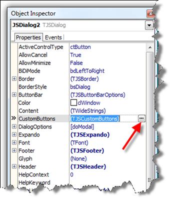 Object Inspector
Locate the Custom Buttons property in the object inspector for the dialog you want to add a custom button to. Click on the ellipsis next to the property in the object inspector (Figure 3).
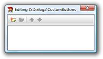
Figure 4
The default collection editor (Figure 4) will then appear. To add a new custom button click on the Add New toolbar command.
Figure 5 shows the added custom button. To modify the properties for the new custom button activate the object inspector (F11).
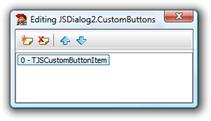
Figure 5
There are a number of properties that can be set when creating a Custom button. Some properties are only valid for Command Link buttons (which will be discussed next) so they can be ignored.
Figure 6 highlights the properties that are applicable to Custom buttons.
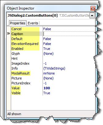
Figure 6
|
Property Name |
Description |
|
|
Cancel |
Set the Cancel property to
true for the button to act as the dialogs Cancel action. The Cancel action
occurs when the user presses the Escape key. |
|
|
Caption |
The Caption for the button.
Include an accelerator key by prefixing the key with the ampersand (&)
symbol. |
|
|
Default |
Set the Default property
to true for this button to act as the dialogs Default action. The Default
action occurs when the user presses the Enter key. |
|
|
ElevationRequired |
Set to True to display the
elevation shield on the button. It is up to you to write the code to invoke
the elevation functionality. |
|
|
ModalResult |
Assign the button a modal
result value. Make sure each custom button has a unique ModalResult value. Each
of the buttons on a dialog should have a unique modal result value. |
|
|
Value (readonly) |
The Value property is
automatically assigned and cannot be changed. Use the Value property of the
custom button to help identify when the button has been invoked. You can also use the GetControl
method to get the actual TControl reference of a button with a particular
value. Typecast[2]
the TControl value to either a TButton or TBitBtn. |
|
|
Visible |
Set the Visible property
to False to hide the custom button from the dialog. |
|
Table 2
You can add Custom buttons using the component editor that is included with TJSDialog. Invoke[3] the component editor for your dialog.
Navigate to the Custom buttons tab page of the component editor.
Click on the Add button to add a new custom button to the dialog (Figure 7)
Once you have clicked on the Add button, the Custom button page will become enabled for input. Figure 8 highlights the properties that are relevant when creating a Custom button we want to create.
As an example enter in the following property values
|
Property Name |
Property Value |
|
Caption |
Hello World |
|
ModalResult |
mrOK |
Table 3
Once you have done this, click on the Save button. You must always click on the Save button to save the changes you have made to the Custom button.
Figure 9 shows what happens once you have saved the new Custom button. The buttons caption is displayed in the list to the left. Select a button from the list to view its properties.
You can edit existing Custom buttons by selecting the button from the list and then pressing the Edit button.
To delete a Custom button using the component editor, select the Custom button you want to delete from the list, and then press the Delete button.
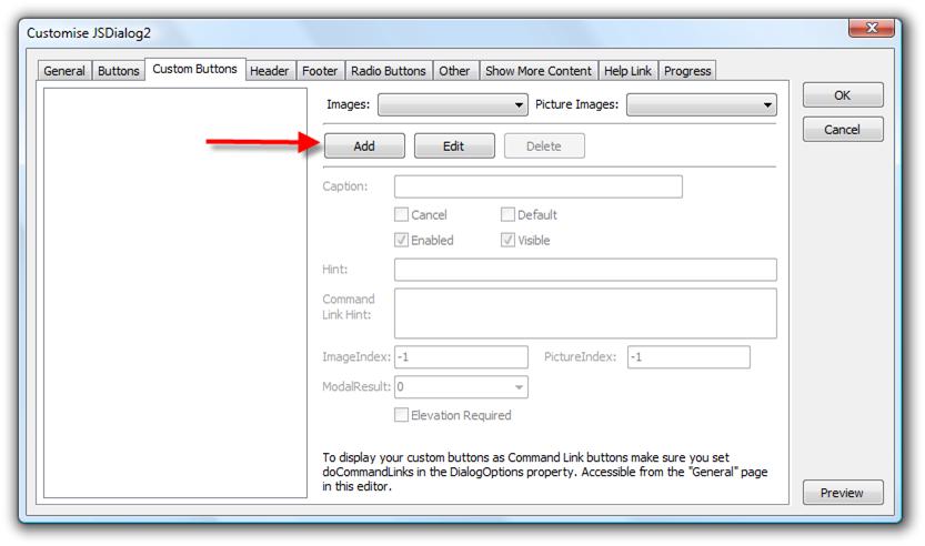
Figure 7
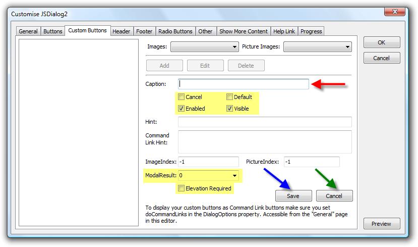
Figure 8
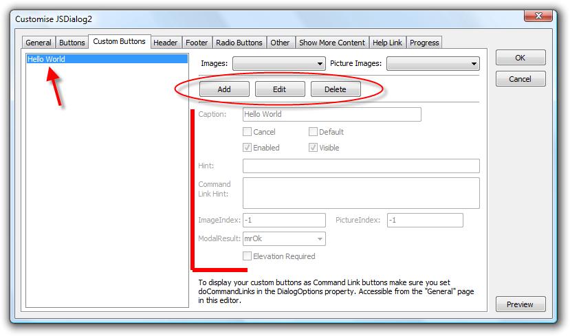
Figure 9
Use the preview functionality of the component editor to preview how the dialog is currently looking. Click on the Preview button in the lower right hand corner of the component editor.
NOTE: There is also a preview command in the context menu for the component at design time.
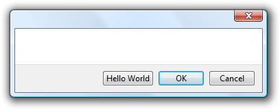
Figure 10
Figure 10 shows how the dialog will currently look. It does look a little odd without any content or title but as you can see, the Custom button is visible.
var
lBtn: TJSCustomButtonItem;
begin
lBtn := JSDialog2.CustomButtons.Add;
lBtn.Caption := 'Hello All';
lBtn.ModalResult := mrAll;
end;
JSDialog2 is the name of the TJSDialog component that the Custom button is being added to.
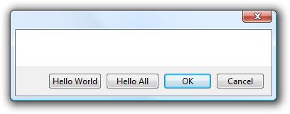
Figure 11
Figure 11 assumes that your dialog already has the Hello World button that was added when using the Component Editor method above.
NOTE: Notice how Custom buttons are displayed with the first button added as the left most button. Custom buttons will always appear to the left of any common buttons.
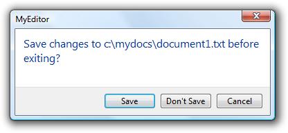
var JSDialog2: TJSDialog; lBtn: TJSCustomButtonItem;begin JSDialog2 := TJSDialog.Create(Self);try
JSDialog2.Instruction.Text := 'Save changes to c:\mydocs\document1.txt before exiting?';
lBtn := JSDialog2.CustomButtons.Add;lBtn.Caption := 'Save';
lBtn.Default := True;
lBtn.ModalResult := mrOK; lBtn := JSDialog2.CustomButtons.Add;lBtn.Caption := 'Don'#39't Save';
JSDialog2.ButtonBar.Buttons := [cbCancel];JSDialog2.Title := 'MyEditor';
case JSDialog2.Execute of
mrOK: ;// perform Save
mrCancel: ;// perform Cancel
mrNone: ;// perform Don't Save
else
;// perform Don't Save
end;
finally
JSDialog2.Free;end;
end;
The most visually appealing of buttons available for use on a dialog is the Command Link button. The Command Link button is not displayed in the Button Bar section of the dialog but within the content section.
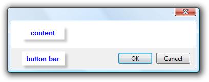
Figure 12
Figure 12 shows the different sections.
Command Link buttons are a new button style introduced in Microsoft Windows Vista. By using TJSDialog you are not restricting the use of this button style to just Microsoft Windows Vista though.
The Command Link button allows you to associate an image to the left of the caption. There is also a default image (a green arrow) that can be used. A Command Link button can also contain additional text displayed under the button caption. This additional text is referred to as the Command Link Hint. Generally it gives additional information about the action to be performed by the Command Link button when executed. The Command Link Hint is displayed using a smaller font size.
Mentioned earlier was the fact that you setup your Command Link buttons on the Custom Buttons tab just like you did for Custom buttons. To display Command Link buttons instead of the default Custom buttons you just need to make sure either doCommandLinks or doCommandLinksNoIcon is specified in the DialogOptions set for the dialog.
Revisit the Custom buttons section and add a Hello World custom button to a TJSDialog on a form.
Select the dialog you want to enable Command Links for and locate the DialogOptions property.
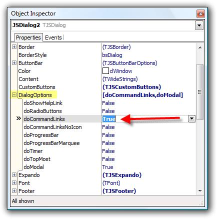
Figure 13
Invoke the component editor and make sure the checkbox next to the doCommandLinks checkbox in the Options group is checked. Verify your changes with Figure 14.
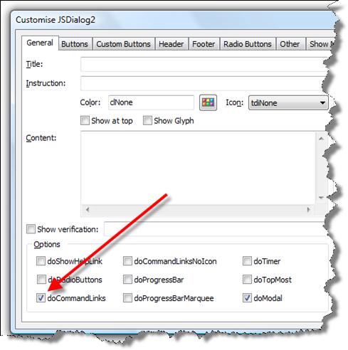
Figure 14

Figure 15

Figure 16
Figure 15 shows the Command Link unselected. The mouse cursor is not within the bounds of the Command Link button. Figure 16 does show the Command Link with the mouse cursor within its bounds. Note how the button displays differently when highlighted.
When a Command Link button is the default button for the dialog, the button has the aqua colour border around it when not highlighted. Otherwise there is no visible border for the button.
NOTE: The capture application used to capture images in Figure 15 and Figure 16 are different to the application used to capture other images in this document. So it looks slightly different (no dialog drop shadow for example).
var JSDialog2: TJSDialog; lBtn: TJSCustomButtonItem;begin JSDialog2 := TJSDialog.Create(Self);try
JSDialog2.DialogOptions := [doCommandLinks, doModal]; lBtn := JSDialog2.CustomButtons.Add;lBtn.Caption := 'Hello World';
lBtn.Default := True;
lBtn.ModalResult := mrOK; JSDialog2.ButtonBar.Buttons := [cbCancel]; JSDialog2.ButtonBar.UseDefault := False;if JSDialog2.Execute = mrOK then
;finally
JSDialog2.Free;end;
end;
Use the component editor to give the Hello World Command Link button a command link hint value of Click this button to display the current date and time information.
When previewing your dialog it should look like Figure 17.
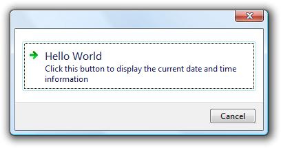
Figure 17
· Change the Glyph property to a custom 16 x 16 glyph. (DialogOptions must include doCommandLinks in order to view the glyph).
· Change DialogOptions to include doCommandLinksNoIcon instead of doCommandLinks.
By default, if the user clicks on a Common button, the dialog will automatically set the dialog ModalResult value and close. You cannot change the Common button behaviour.
You can change the Custom button behaviour though. These steps assume you are using the Hello World Command Link button dialog mentioned above.
Handling a Custom button click event
1. Select the dialog component in the designer
2. Display the object inspector (F11)
3. Click on the Events tab at the top of the object inspector
4. Locate the OnControlClick event and double click it to generate an event stub
5. Place the following code in the event
procedure TForm20.JSDialog2ControlClick(Sender: TObject; ControlType:
TControlType; Control: TControl; const Value: Integer;
var Handled: Boolean);
beginif ControlType = ctCommandLink then
begin
if Value = 100 then
begin
ShowInfoTitleMessage('Current Date and Time',
FormatDateTime('dd mmmm, yyyy hh:nn:ss', now));
Handled := True;end;
end;
end;
Let’s analyse the source code for handling the event.
:: if ControlType = ctCommandLink then
We are only interested in processing the click event for a Command Link button so it makes sense to check to see what the ControlType is of the object that generated the event.
:: if Value = 100 then
We only want to process
clicking of the Hello World button which we know has the Value 100 assigned to
it. Additional Command Link buttons increment the Value property by 1. So if we
added another command link button, its Value property would be 101.
:: ShowInfoTitleMessage('Current Date and Time',
FormatDateTime('dd mmmm, yyyy hh:nn:ss', now));
This code
shows another dialog that contains the current date and time details. Note that
the ShowInfoTitleMessage method is defined in the JSDialogs unit. The JSDialogs
unit has a number of wrapper functions defined in it. Demo5 that ships with
TJSDialog also demonstrates the usage of some of the available wrapper
functions.
:: Handled := True;
This line of code is very
important. If you DO NOT want the default button click handling to occur, you
must set Handled to True. Otherwise clicking this button would close the dialog
as well and in this case, we do not want this to happen.
Common buttons will always use the TButton class.
Custom buttons will always use a TButton unless the following is true
· ElevationRequired is set to TRUE and the operating system is not Vista
Custom buttons that are set to be displayed as Command Link Buttons (DialogOptions contains either doCommandLinks or doCommandLinksNoIcon) use the TJSCommandLinkButton class. This class is defined in the JSButton unit that ships with TJSDialog.
You can also specify a different class altogether to be used to represent buttons on a TJSDialog. To do this you must handle the OnGetControlClass and OnInitControl methods to setup your custom button class with the information that is available.
An example of using these events is included in the Demo1 sample application that ships with TJSDialog. The sample is located on the Advanced tab and the buttons caption is called Custom Controls. Figure 18 shows the dialog running under Vista.
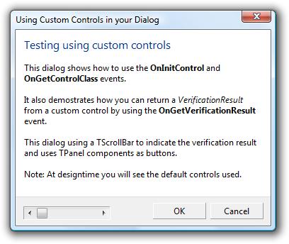
Figure 18
TJSDialog ships with a comprehensive component editor which allows you to change most properties from a tabbed dialog. The component editor groups properties into their respective areas of purpose and can make changing the properties easier.
The component editor also allows for a better user interface for changing the properties.
Figure 19 shows a typical form at design time.
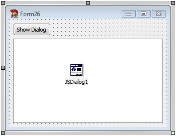
Figure 19
To access the component editor for the JSDialog1 component there are two options.
1. Double click on the component and the component editor will display.
2. Right click on the component to display the components context menu and select the Customise menu item. The correct menu item is displayed in Figure 20.
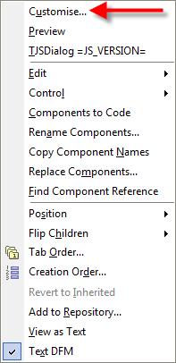
Figure 20
In Figure 20 you can also see two other commands on the right click menu.
Preview Select this command to preview the dialog. You do not have to preview the dialog within the component editor if you don’t want.
TJSDialog =JS_VERSION= The
command does nothing when clicked but will tell you the actual version of the
TJSDialog component you are currently using. This version is only populated at
build time which is why you see the variable in Figure 19.
The Help file contains
information on how to localise the Common button captions to your native
language. There is a compiler define you can include to do the translation at
compile time, or a runtime substitution framework to change the captions at
runtime.
The Help file and also Demo1 (Localisation
tab) gives further information and examples on how to do this.
[1] The default English captions can be changed. Refer to the localisation section for more information.
[2] Refer to Appendix A to see under what circumstances the returned reference will be either a TButton or a TBitBtn
[3] Refer to Appendix B to see how to invoke the component editor
Article that provides information on how to use the different types of button options available on a dialog.
|
Copyright © 2013 by LMD Innovative. All rights reserved.
|
|
What do you think about this topic? Send feedback!
|


 Group
Group